Thursday, November 13, 2008

Reflections

Creating this weblog has certainly taught me a few lessons in publication for the new media. Transferring information from print to online (e.g. journals in hard copy) for one taught me about how multimodality works as explained by Walsh, M (2006).

Apart from that, this weblog gave me insight to what I do when I have free time – blogging. How did this come about? How many bloggers are there? Gathering information to educate my readers has also taught me that the new media is always changing, and we ought to look forward to the newest form it will come to be. From the television to vlogs on YouTube, who knows what else shall soon follow?

Indeed there are issues to be addressed when it comes to this. Copyright infringement for one, ethical concerns another, and even stripped down to the basics of creating a site pleasant and easy on the eyes.


Reference

Walsh M., 2006, The ‘textual shift’: Examining the reading process with print, visual and multimodal texts, Australian Journal of Language and Literacy, vol. 29, no. 1, pp. 24-37.
Online Advertising Always A Go

It's not difficult to get annoyed at the sight of advertisements nowadays. In print, they're still and disposable. But when it comes to online advertising, you get a vast array of different types of advertisements.

There's the roll-your-mouse-over advertisements that would enlarge, blocking your view on the desktop (usually found on Windows Live Messenger and Hotmail.com), there's the blinking banner that would scream You've Won A Million Dollars!, and also the one that would appear in the middle of an article you're reading intently. Annoying or not, these advertising companies gain profit through it. In fact, these advertisements are sometimes relevant to what you need and want. Out of a million different interests on advertisements, you somehow come across what you are keen in.

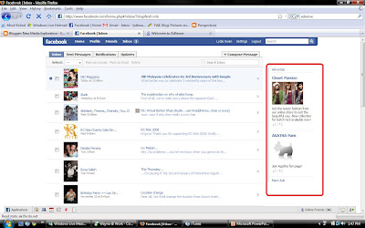
For example, you're an avid Transformers collector. You're on Facebook and you see this annoying advertisement on your right panel only to realise you've clicked on it just because XL Toys, a collector's shop, is having a massive sale. Any funny enough, you're on a networking site. You have your details keyed into the system. Is a third party accessing your information, hence feeding you these advertisements they know you'd click?

Source: Facebook.com

What is behind this? Think AdSense for example.


Source: Google Adsense


In an interview with ABC, Rex Wong who is founder of the company gave a little insight on this issue. He said that it would be a good thing for both consumers and the client (to the advertisements), because consumers would not see things that they do not want to buy but the other way around instead. "It's not that people don't want to watch ads, I believe, it's that people want to watch ads that interest them" (ABC.net.au, 2008).

An ongoing debate about personal information stored online has sparked compliants against MySpace and Facebook too, because the question on privacy has been raised. However, there are companies who do not bend unspoken/spoken rules, such as Nuffnang and Advertlets in Malaysia. Placed on blogs by blog authors, these advertisement are skewed to the genre and content of the blogs.


References

Social Networks and Online Advertising, Media Report, ABC.net.au, viewed 11 November 2008,
<http://www.abc.net.au/rn/mediareport/stories/2007/2124221.htm>

No Txt, Tks!

OMGYG2BK. SIMYC. ROFLCOPTER. PSOS. n00b.

That's text messaging language for you. Kudos if you understood those terms and if you couldn't, you're not the only one. There has been an ongoing debate on whether text messaging is killing the language as Englsh was never meant to be spelled without the "i". Then again, we have to revert back to the past to think of why this became such a well-known issue.

Source: BBC.co.uk

But is it a threat to the English language today? In an interview with linguist David Crystal, he disagrees as he considers it as a way to promote literacy. In fact, the birth of poetry in this text language connotes a development to the language (ABC.net, 2008). abbreviations were explained to have been around for years, for example Queen Victoria's (extremely confusing) abbreviation game (ABC.com, 2008). But all of a sudden, there was an uproar of text messaging. Why?

Source: SydneyMorningHerald.com.au

In my opinion, it started with the mobile phone and bills for its use. If you are familiar with such devices, it wouldn't be an alien thing to know you have a limit of maybe 160 characters for one page of a message, of which would be RM0.20 (back in 2002). Add a few more characters over the limit and you would have to pay an extra RM0.20. This is one of the cause of the rise of text messaging language.

Then you have online chats whether through chat channels like Windows Live Messenger or through chat panels on online games like World of Warcraft. These will unconsciously require fast and short sentences and words, causing "you" to be "u" and "got to go" to be "gtg". Very colloquial, very fast, very easily typed. Of course, text language isn't used on formal sites as it rubs off as unprofessional and uncomprehending.


References

Txtng Rls!, Media Report, ABC.net, viewed 11 November 2008,
<http://www.abc.net.au/rn/mediareport/stories/2008/2330972.htm>

Text Messaging Abbreviations, Webopedia.com, viewed 11 November 2008,
<http://www.webopedia.com/quick_ref/textmessageabbreviations.asp>

Flaunt Or Form?

While working on the earlier posts with tutorials taken from Jakob Nielsen's website, I couldn't help but create own very own judgments on the (what I thought was) horrible HTML-based layout. It was beyond appealing, I hated staying for long and I found myself running back to ICanHasCheezburger.com to laugh at cats.

Jakob Nielsen is an accomplished web designer as seen here on the cover of .net magazine
Source: UseIt.com

UseIt.com, Jakob Nielsen's website looks dull and unattractive
Source: UseIt.com


When I got back on track to write this blog, I scoured through the internet to figure out why Jakob Nielsen, the highly acclaimed web designer, had used his layout despite knowing how a good or fancy it could look. In an interview with The Guardian, Nielsen was said to be "the man that some web designers love to hate", referring to his website. But why is he a guru?

Nielsen thinks of download time, because it "rules the net" (UseIt.com, 2007). Graphics (images, flash, etc.) would add on to the size of the page, causing a slow page load hence affecting the attention of the reader. "Users do not keep their attention on the page if downloading exceeds 10 seconds, corresponding to 60 KB at modem speed. Keeping below these size limits rules out most graphics" (UseIt.com, 2007).

In fact, he shared a little about "upsetting people" because it would "create an impact" (The Guardian, 2007). Nielsen keeps his website simple and concise without adding anything irrelevant, because form preceeds flaunt and his readers know it.

Sure, it might not be the prettiest thing on the internet but it is user-friendly as he used colour tones to create some salience in the website, and some white space and colours again to assist to the framing of elements in the document so the reader can differentiate one to another (Kress & van Leeuwen 1998, p. 188). He uses sans-serif fonts as well, as it is easy on the readers' eyes when it comes to an online document.

However, he could make some changes to make it even more user friendly with margins on the left and right sides, as well as different fonts to differentiate between sections.


References

Nielsen J., Why No Graphics, UseIt.com, viewed 11 November 2008,
<http://www.useit.com/about/nographics.html>

The web design guru that web designers love to hate, Guardian.co.uk, viewed 11 November 2008,
<http://www.guardian.co.uk/technology/2007/aug/09/guardianweeklytechnologysection.interviews>

Kress, G. & van Leeuwen, T., 1998, Chapter 7: Front pages : (the critical) analysis of newspaper layout, Approaches to media discourse, Blackwell, Oxford.

All Time Favorite "Cheezburger"

One of the most popular meme and humor blog, I Can Has Cheezburger? (ICHC) under the Cheezburger Network has raised eyebrows on its success under CEO Ben Huh. According to Cheezburger.com, the site has received numerous web awards such as the Technorati Top 10 Blogs and the 8th most powerful blog by The Guardian. The site has also been said to be “edging towards 30 million page views a month” (CNet.com, 2008) as well as receiving "an average 2 millions page views and 8,000 submissions each day" (Wired Blog Network, 2008).

ICHC CEO Ben Huh (middle)
Source: Wired Blog Network

A LOLCat
Source: ICanHasCheezburger.com


The site uses “LOLSpeak”, a term used for deliberate misspellings and wrong grammar such as “iz” for “is”, “nom” for “eat” and “oh hai” for “oh, hi” (SpeakLOLSpeak.com). “LOLSpeak” is used to caption images of cats (and a minority of other animals for this specific blog) to add ridiculous humour to it, and then compiled in a series of photographs.

The question concerned in this topic is how and why is it so popular? What is it that makes readers hooked onto it that they come back for more the next day?

Another LOLCat
Source: ICanHasCheezburger.com


On a basic understanding, Shriver (p. 415, 1997) said, "words and pictures that complement one another employ different visual and verbal content, and both modes are designed to work together in order to help the reader understand the same main idea (the same referent)." The images would not mean anything without the captions, hence generating humour which touches the human interest.

Ben Huh was smart enough to focus on what seemed most important to him - the community. According to an interview with CNet.com, Huh said that building up community features would keep people coming back. He also smartly converted casual-based visitors to fans, hence growing the community (CNet.com, 2008).

Huh also played around with language by buying misspelled versions of the web site name. He also stayed with a safe layout that went straight to the point, giving readers exactly what they want instantly - their daily dose of laughter. The goal for readers "to be happy for 5 minutes every day", is easily achieved with a simple layout and few fresh new entries everyday. Because there are a lot of images and widgets, framing was induced correctly with different colors and margins to "simultaneously both disconnect the elements of a layout from each other" (Kress & van Leeuwen 1998, p. 188).


References

Kress, G. & van Leeuwen, T., 1998, Chapter 7: Front pages : (the critical) analysis of newspaper layout, Approaches to media discourse, Blackwell, Oxford.

Shriver K.A., 1997, The interplay of words and pictures, Dynamics in document design : creating texts for readers, Wiley Computer Pub., New York.

Advertise on ICHC, ICanHasCheezburger.com, viewed 11 November 2008, <http://icanhascheezburger.com/advertise-on-ichc/>

McCarthy C., Ben Huh can has successful business model?, CNet.com, viewed 11 November 2008, <http://news.cnet.com/8301-13577_3-10062366-36.html>

Terdiman D., The history of I Can Has Cheezburger, CNet.com, viewed 11 November 2008,
<http://news.cnet.com/8301-13772_3-10023722-52.html>

Wortham J., ROFLCon: It's Not Easy Being Memes, Wired Blog Network, viewed 11 November 2008, <http://blog.wired.com/underwire/2008/04/its-hard-out-he.html>

The Definitive Lolcats Glossary, SpeakLOLSpeak.com, viewed 11 November 2008,
<http://speaklolspeak.com/?t=anon/>

Wednesday, November 12, 2008

New Forms of Media Publishing

Text, photos, videos - just the basic ways of communicating a message but now in new forms. These new forms include vlogs, moblogs and the likes of it. This is linked to multimodality, as according to Walsh (p.24, 2006), "Multimodal texts are those texts that have more than one' mode', so that meaning is communicated through a synchronisation of modes."

Depending on the author's purpose, their messages can now be conveyed in different ways, e.g. videos on YouTube for self-publicity. For example: KokoKaina used YouTube to upload her own music videos and was then discovered and signed to Brushfire Records (KLue, 2008).


Someone You Used To Know - KokoKaina
Source: YouTube.com (2008)


Newspapers have also began to produce online versions, with some charging for viewing and some free for all. This makes it easy to backtrack and refer to archives. For example, The Star Online which provides free access to the public. The online newspaper has several different sections such as the Star R.AGE Blog and In-Tech.

The Star Online
www.thestar.com.my


References

Chan S., Online Explosion, KLue Online, viewed 11 Novemeber 2008,
<http://www.klue.com.my/articles/664-Online-Explosion>

Someone You Used To Know - KokoKaina, YouTube.com, viewed 11 November 2008,
<http://www.youtube.com/watch?v=bqR3D1pr9_Q>

Walsh M., 2006, The ‘textual shift’: Examining the reading process with print, visual and multimodal texts, Australian Journal of Language and Literacy, vol. 29, no. 1, pp. 24-37.

Tuesday, November 11, 2008

Designing for Online vs Print

When it comes to publishing for online and print, it differs in many ways as both are of different mediums transmitted through different ways although they both share a few elements (e.g. the need of white space, proper framing, complimenting the document with images).

Designing for online becomes a whole different story because there are several given abilities that overshadow print. Links, keyword searches, animated headlines and graphic advertisements are now taken into consideration as it affects the readability of the document. Readers online are known to be impatient, hence document designers should be cautious about elements added to it. Large amount of images and graphics would cause a slow page load, hence leaving its readers to turn away after a count of 5 seconds. Readers also read in an F-shaped pattern according to Nielsen's new eyetracking study (UseIt.com, 2007). Headlines have to be short, precise and catchy, as longer words require longer attention span and colours are to be in the RGB mode.

The F Pattern
Source: Jakob Nielsen; www.useit.com/alertbox/reading_pattern.html

Online version of Junk Magazine
www.junkonline.net


When it comes to print, readers read from left to right and in a Z pattern. They have a longer attention span compared to reading online publication while the colour model used is CMYK.


Cover of Junk Magazine

Page spread of Junk Magazine


References

Nielsen J., F-Shaped Pattern For Reading Web Content, UseIt.com, viewed 11 November 2008,
<http://www.useit.com/alertbox/reading_pattern.html>

Nielsen J., Writing Style for Print vs. Web, UseIt.com, viewed 11 November 2008,
<http://www.useit.com/alertbox/print-vs-online-content.html>
Site Meter